Wellness Practitioner Platform

Daniel K. Adam
Product Designer
Menu
Close

UI/UX, Product strategy
CEO, CTO, Dev team
I lead design at Heal.me, a wellness booking and management platform for holistic practitioners and clients.
On iOS, Android and desktop, striving to create the best in wellness platform experience. I also worked on leveling up our marketing & brand designs, providing client communications & reminders on and off platform.
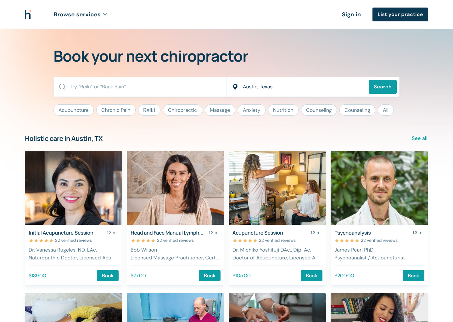
Reducing booking friction
My goal was to reduce booking friction and improve the overall user experience. The main challenge was to make the entire booking process as seamless and straightforward as possible, while still providing users with all the necessary information and options they need to make informed decisions.

Desktop redesign

Old homepage-- acted like a leaflet
New-- jumps straight to the product

Old search-- text heavy, weak CTA

New-- clean, location based, CTA

Old profile-- small timeslots, no service images.

New-- immersive booking experience, eye-catching service images.
Search filters
As part of the redesign, filters were added to the search page to help users narrow down their options and find the best practitioner for their needs. This was in response to feedback from user research, who reported that they were often overwhelmed by the number of options available and had difficulty finding the right pick. The filters I added included options to filter by price range, availability, location, therapy and other relevant criteria. Users could apply one or multiple filters at once, and the results would update in real-time. The filters were prominently displayed on the search page, and users could easily see which filters were applied and adjust them as needed.

Smooth, smart animations
By adding "ghosting" and smooth transitions, the application became more user-friendly and intuitive, with clear visual cues and seamless transitions between views. This helped users better understand the application's functionality and reduced the cognitive load associated with navigating through the application. Dynamic components use more horizontal space while virtual search is applied.

Mobile app
I designed a client companion app for appointment management and easy rebookings.
Homepage
Rebooking on recent appointments.


Appointments
Rebook past appointments.


Practitioner page
Redesigned profiles and services.
Booking flow
Reduce friction by not requiring a credit card for initial bookings.


Professional photoshoot

Email experience
To reduce booking friction, I designed new email funnels that provided users with relevant appointment information, reminders, and incentives to book again.

Design system components
The rich text element allows you to create and format headings, paragraphs, blockquotes, images, and video all in one place instead of having to add and format them individually. Just double-click and easily create content.

Summary
During my time with Heal.me, I had the opportunity to own the entire design process for a diverse range of users and help solve their problems. While the work could be challenging at times, it was also incredibly rewarding to be able to assist them in a meaningful way.
Since the redesign went live bookings have increased by 200%.
